

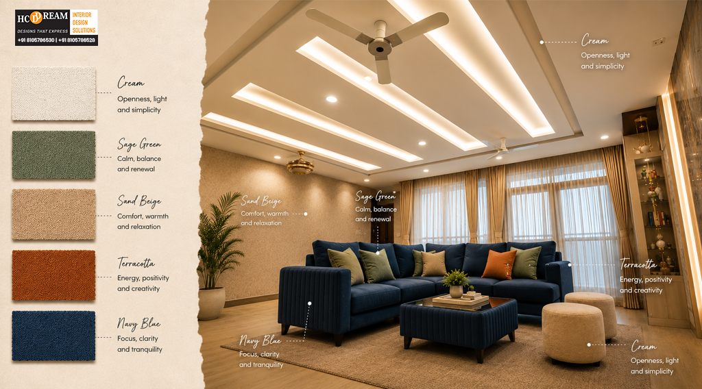
A room can feel calm, energetic, spacious, warm, or even overwhelming before you consciously understand why. Often, the difference comes down to color.
The colors surrounding us influence how a space looks and can also shape how we experience it. A soft bedroom palette can make evenings feel more peaceful, while warmer tones in a dining area can create a more inviting atmosphere.
For homeowners, choosing colors is therefore about much more than matching walls with furniture. It is about creating an environment that supports everyday life.
At HCD DREAM Interiors, we consider color an important part of thoughtful home design. As a premium interior design firm in Bangalore, our approach combines aesthetics, functionality, and lifestyle to create spaces that feel beautiful and comfortable.
Whether you’re designing a new apartment, renovating a family home, or exploring fresh home color ideas, understanding color psychology in interior design can help you make more confident choices.
Why Color Matters in Interior Design
Color influences the first impression of a room.
A bright, open palette can make a compact apartment feel more spacious. Deeper tones can add intimacy and character to a large room. Natural shades can create a sense of calm, while carefully selected accents can bring energy into otherwise neutral spaces.
Color also interacts with:
- Natural light
- Artificial lighting
- Furniture finishes
- Flooring
- Room size
- Ceiling height
- Textures
- Decorative elements
That means the same shade can look completely different in two homes.
A color that feels warm and inviting in a sun-filled living room may appear darker in a room with limited natural light. Good interior planning considers the entire environment rather than choosing colors from a sample card alone.
Understanding Color Psychology in Interior Design
Color psychology in interior design explores how different colors can influence the atmosphere and emotional experience of a space.
While individual responses to color vary, certain broad associations can help guide design decisions.
Blue: Calm and Composed
Blue is often associated with calmness and tranquillity.
Soft blues can work beautifully in bedrooms, reading areas, and relaxing corners where you want a quieter atmosphere.
For a sophisticated look, pair muted blue with:
- Warm wood
- Off-white
- Beige
- Brass accents
Green: Natural and Refreshing
Green brings associations of nature and freshness into interiors.
Muted sage, olive, and earthy greens can work particularly well when combined with natural textures and indoor plants.
It is a versatile choice for living rooms, bedrooms, and workspaces.
Yellow: Bright and Optimistic
Yellow can introduce warmth and energy.
Instead of using intense yellow across an entire room, consider it for smaller accents such as cushions, artwork, chairs, or decorative pieces.
Soft mustard and warm ochre can create a more sophisticated appearance.
White: Clean and Spacious
White remains one of the most popular choices for modern interiors.
It reflects light and can make rooms appear more open, especially when paired with appropriate lighting and carefully selected textures.
However, an entirely stark white room can sometimes feel cold. Warm whites, ivory, cream, and off-white can create a softer result.
Beige and Earthy Neutrals: Warm and Timeless
Beige, taupe, sand, and warm greige are excellent choices for homeowners seeking timeless interiors.
These colors provide a calm foundation that allows furniture, artwork, lighting, and textures to become visual highlights.
How Colors Affect Different Rooms
Every room serves a different purpose, so the ideal palette can change from one space to another.
Living Room: Welcoming and Versatile
The living room is where families relax, entertain guests, and spend time together.
Neutral foundations work well because they provide flexibility. You can then introduce personality through accent colors, artwork, upholstery, and accessories.
Consider combinations such as:
- Warm beige + walnut
- Ivory + sage green
- Greige + muted blue
- Cream + terracotta
The goal is to create a room that feels welcoming without becoming visually overwhelming.
Bedroom: Calm and Restful
Bedrooms should encourage relaxation.
Soft neutrals, muted greens, dusty blues, warm beige, and subtle earthy shades can help create a peaceful visual environment.
For a premium bedroom, consider using one dominant tone with layered textures rather than filling the room with multiple competing colors.
Kitchen: Fresh and Practical
Kitchens can handle brighter and more energetic combinations.
White cabinetry with wood finishes creates a timeless look. Soft green or blue can introduce personality without making the space feel dated.
For modern apartments, lighter cabinet colors can also help create an open appearance.
Home Office: Focused and Comfortable
Your workspace should feel stimulating without becoming distracting.
Soft neutrals, muted greens, warm whites, and subtle blues can provide a balanced backdrop.
Avoid excessive use of highly saturated colors if they make it difficult for you to concentrate.
What Colors Make Small Rooms Look Bigger?
If you’re designing a compact Bangalore apartment, color can become an important space-enhancing tool.
Lighter shades generally reflect more light and can help a room feel more open.
Consider:
- Warm white
- Ivory
- Light beige
- Pale grey
- Soft sage
- Light blue
But creating a spacious feeling isn’t only about painting everything white.
You can also use:
Consistent Color Flow
Using related shades across connected spaces can make the home feel visually continuous.
Light-Colored Ceilings
A lighter ceiling can create the impression of greater height.
Reflective Finishes
Mirrors, glass, and selected glossy surfaces can help distribute light around a room.
Strategic Contrast
A carefully placed darker accent can actually add depth without making the entire room feel smaller.
This is where professional planning becomes valuable.
How to Choose Colors Based on Natural Light
Natural light changes the way colors appear throughout the day.
Before finalizing a wall color, consider how much sunlight enters the room and at what time.
Bright, Sun-Filled Rooms
These spaces can accommodate cooler tones, earthy colors, and deeper accents because abundant light can balance them.
Low-Light Rooms
Warm whites, creams, soft beige, and gentle pastels can help prevent the space from feeling gloomy.
Artificially Lit Spaces
Always check samples under the lighting you intend to use. Warm LED lights can make colors appear richer and more yellow, while cooler lighting can make them appear sharper.
This small step can prevent expensive repainting later.
Creating a Balanced Color Palette
A successful interior rarely uses every color you love.
Instead, designers typically create a visual hierarchy.
A simple approach is to think in three layers:
Dominant Color
This covers the largest surfaces, such as walls, flooring, or major furniture.
Supporting Color
This adds depth through cabinetry, upholstery, curtains, or larger decorative elements.
Accent Color
This creates personality through artwork, cushions, lighting, accessories, or smaller furniture pieces.
The result feels coordinated without becoming monotonous.
Home Color Ideas for a Premium Look
If you want your home to feel sophisticated, consider palettes that combine subtle colors with contrasting textures.
Warm Minimalism
Ivory + beige + walnut + muted brass
Ideal for homeowners who prefer understated luxury.
Earthy Contemporary
Sage + cream + natural wood + terracotta
Creates a warm connection with nature.
Modern Sophistication
Greige + charcoal + oak + soft white
Works particularly well in contemporary apartments.
Soft Luxury
Warm white + dusty blue + beige + brushed metal
Creates an elegant yet comfortable atmosphere.
The secret isn’t using expensive colors. It’s choosing combinations that work harmoniously with the architecture and lifestyle.
Should Every Room Have a Different Color?
Not necessarily.
Using completely different palettes in every room can make a home feel disconnected.
Instead, create a visual thread throughout the home.
For example, you could use warm beige as the foundation and introduce different accent colors in individual rooms.
The living room might feature sage green, the bedroom muted blue, and the study warm terracotta.
The home still feels cohesive because the underlying palette remains connected.
Common Color Mistakes Homeowners Should Avoid
Color decisions can become expensive when made without considering the complete interior.
Avoid these common mistakes:
- Choosing paint before selecting major furniture and finishes.
- Ignoring natural and artificial lighting.
- Using too many accent colors.
- Selecting colors solely from online images.
- Making every room completely different.
- Using dark colors excessively in compact spaces.
- Following trends without considering personal preferences.
A color may look beautiful in a showroom and still feel wrong in your home.
The best palette is the one that works with your space and your lifestyle.
How Professional Designers Use Color More Effectively
A professional designer looks beyond individual colors.
They consider how walls, furniture, flooring, lighting, fabrics, and architectural details interact.
For homeowners searching for the Best Interior Design Company in Bangalore, this broader perspective can make the design process more efficient.
A designer can help you:
- Understand the character of your space.
- Build a cohesive color palette.
- Coordinate colors with materials.
- Balance natural and artificial lighting.
- Create room-to-room visual continuity.
- Add personality without overwhelming the interiors.
This approach helps ensure that the final home feels intentional rather than assembled piece by piece.
Why Bangalore Homes Benefit From Thoughtful Color Planning
Bangalore homes come in many forms, from compact city apartments to spacious villas.
Modern lifestyles also demand flexible interiors that support work, relaxation, family time, and entertaining.
Color can help define these experiences without physically changing the layout.
A calm palette can distinguish a bedroom from a lively social space. A brighter kitchen can feel fresh and energetic. A sophisticated study palette can establish a focused working environment.
For homeowners looking for a Best Interior Designer in Bangalore, understanding these lifestyle considerations is just as important as knowing current design trends.
Color Is About More Than Decoration
The right color can change how a room feels when you enter it.
It can make a compact apartment appear brighter, turn a bedroom into a calming retreat, or give a living room a sense of warmth and personality.
But color works best when it is part of a larger design story.
At HCD DREAM Interiors, we look at color alongside space planning, lighting, furniture, materials, and the way each family actually lives.
For homeowners searching for Interior Designers Near me Bangalore, this holistic approach can turn color selection from a stressful decision into an exciting part of creating your dream home.
FAQs
1. How do colors affect mood?
Colors can influence the atmosphere of a room and how people perceive it. Soft blues and greens can create a calmer feeling, while warmer shades can make spaces feel energetic and welcoming. Personal preferences and lighting also influence the experience.
2. Which colors make homes feel peaceful?
Soft neutrals, muted greens, gentle blues, warm whites, beige, and earthy tones are popular choices for peaceful interiors. These shades work especially well in bedrooms and relaxation areas when combined with natural textures and soft lighting.
3. What colors make small rooms look bigger?
Light and reflective shades such as warm white, ivory, pale beige, soft grey, and light blue can make compact rooms feel more open. Consistent color flow, good lighting, mirrors, and uncluttered layouts can further enhance the effect.
4. How do I choose colors for each room?
Start by considering the room’s purpose, natural light, existing furniture, and the mood you want to create. Bedrooms generally benefit from calming shades, while living areas can accommodate warmer or more expressive accents. Keep a consistent palette throughout the home.
5. Which color combinations work best?
Successful combinations usually balance a dominant neutral with one or two supporting shades. Warm white with wood, sage with cream, greige with charcoal, and beige with muted blue are versatile options that can create sophisticated, timeless interiors.
Bring the Right Colors Into Your Home
Your home should feel good as soon as you walk through the door.
The right colors can make mornings brighter, evenings calmer, conversations warmer, and everyday spaces more enjoyable. When thoughtfully combined with lighting, materials, furniture, and layout, color becomes one of the most powerful tools in interior design.
At HCD DREAM Interiors, we create homes where every design decision has a purpose. From selecting the right palette to planning complete turnkey interiors, our team brings together aesthetics, functionality, and your individual lifestyle.
If you’re searching for the Best Interior Designers in Whitefield Bangalore or want expert guidance for your next home interior project, HCD DREAM Interiors can help you create a space that looks beautiful and feels unmistakably yours.
Ready to find the colors that belong in your dream home? Get in touch with HCD DREAM Interiors and begin your design journey today.