
How to Choose the Best Interior Designer in Bangalore for Your Dream Home
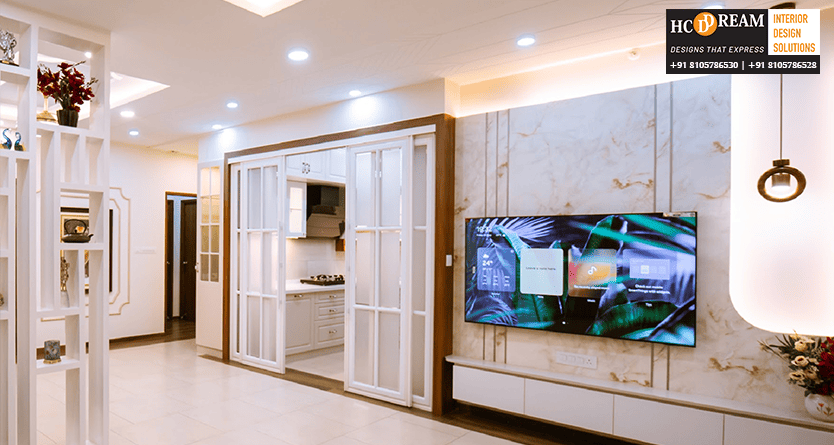
Introduction Designing a home can be an overwhelmingly thrilling, stunningly emotional experience. Each detail contributes to the overall personality of your space and your comfort in it: from the layout of your living room to the decoration of your bedroom. However, creating a home that feels unique to you requires more than simply your taste – it requires your expertise as a planner and your professional designer skills as well. With so many designers, design firms, and freelancers to choose from, it can become exhausting, trying to discern the best interior designer in Bangalore. The right designer will help translate your vision into reality, ensuring that your home is not only beautiful but also functional, uniquely you and timeless. 1. Understand Your Style and Goals Before selecting and contacting designers, take stock of what you love. Do you love minimal, modern spaces with simplistic, clean lines? Or do you love a warm classic interior space, complete with warmth, textures, and patterns? Your aesthetics and style will help you determine what you will want in a designer. Next consider your lifestyle and priorities; do you need a child-friendly space, a formal work-from-home space, or storage-oriented designs? When you indicate your wants, there is less room for interpretation. The best interior designer in Bangalore will take your priorities and create a unique, organic design plan, which is carefully considered yet practical to meet your desired experience. 2. Research and Shortlist Reputable Designers Bangalore is home to a rich interior design community, so kicking off your research on local firms and independent designers online is a great place to start. Check out their webpages, look through their portfolios, and reviews of real-life projects on social media. Reviews on google or Houzz can be helpful as well. Make sure to note how many years of experience they have, diversity in projects, and the kind of design style they gravitate towards. If you see a wealth of projects showing diversity in residential and commercial work, it’s a good indicator that the designer can be both practical and creative. Create a shortlist of 3–5 designers you love to check out their convenient morning consultations. 3. Evaluate Their Design Process A designer’s policies say a lot about their professionalism – it might even give you insight into how your entire project will be carried out. Once you have a few designers in in consideration, it’s a good idea to have them walk through their design policies. Do they make site visits and take time to review details before sharing concepts? Do they share a mood board, sketches, or 3D render of the space? A structured process will help deploy the design in an organized manner keeping everyone in check, so you avoid costly mistakes later on. Your best interior designer in Bangalore will be open and communicative about of the design process each step of the way including – sharing concepts, managing a budget, timing, and taking you to completion. 4. Choose Between Turnkey and Design-Only Services There are different service models offered by different designers. Some will provide a turnkey solution, meaning they handle everything from the design, to sourcing materials, to managing the contractors to perform the work, and finally the finishing details. This option is great if you want a completely hands off process and only want to deal with a single point of contact. Other designers provide design only services, meaning they design the project, layout and plans, and you deal with the contractors for services outside the design aspect. This is a good option for a homeowner who already has trusted vendors, or wants to have control over budgeting. The point is to choose a designer that reflects your level of comfort with their service model and how you intend to approach your project delivery. 5. Be Clear About Budget and Transparency Budget conversations can truly make or break a project. If you have already gone through the process of selecting a design or designer, you should feel comfortable sharing budget expectations upfront. If they are a professional designer, they will respect your financial limits and make recommendations accordingly. Always be sure to ask for a detailed quotation that breaks out material costs, labor, taxes and design fees, so you aren’t surprised later. The best interior designer in Bangalore will not only provide you with open and transparent pricing, but also clarify in their pricing any variation in costs, and recommendations for more cost effective alternatives to achieve the same aesthetic and design intention as initially drafted. Its also important to find clarity on payment milestones and factors that will incur additional charges, which will only add to a positive working experience. 6. Visit Ongoing or Completed Projects Before you reach your final choice, visit one or two completed projects by the designers you are considering in order to help you determine quality of finishes, quality of craftsmanship, and attention to detail. It will also let you see how the design works in real life, such as the practicality, comfort, and functionality of the spaces. If you have the opportunity, also talk to previous clients about how your potential designer kept to their timing, communicated throughout the process and had contact and support afterwards. This type of information is especially valuable when assessing the best designer for your home. 7. Communication and Compatibility Matter You and your designer will work together closely, and the design of your dream home is a cooperative process. Because you will be working together for several months, developing a good rapport is an important part of the process. During your initial meetings, pay attention to how well they listen to your thoughts or ideas. Do they have a genuine interest in your ideas, or do they try to impose their own concept? You want to find the best interior designer in Bangalore who will be your creative partner, taking your thoughts and ideas into consideration while at the same time providing their expertise and experience. They

